

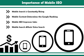
In the current digital era, optimizing your website for mobile devices is no longer optional but essential. With an increasing number of users relying on smartphones and tablets to browse the internet, it’s vital to prioritize mobile optimization. Mobile SEO plays a significant role in ensuring your website not only appears visually appealing on mobile but also ranks well in search engine results. To excel in Mobile SEO tips, follow these tips to enhance user experience, boost visibility, and drive organic traffic.
To assist you in mastering Mobile SEO, we have curated a collection of invaluable Mobile SEO tips that will empower you to optimize your website successfully for mobile devices. By implementing these tips, you can ensure that your website is mobile-friendly, responsive, and provides an exceptional user experience on smartphones and tablets. From focusing on responsive design and fast loading speeds to optimizing for voice search and leveraging mobile-friendly content, these Mobile SEO tips cover a broad range of strategies to enhance your website’s visibility and performance on mobile devices. Stay ahead of the curve and drive organic traffic to your website by following these Mobile SEO tips and maximizing your online presence in the mobile landscape.
First and foremost, a responsive design is the cornerstone of successful Mobile SEO. A responsive website adapts to different screen sizes and orientations, providing a seamless and user-friendly experience across devices. Google also prioritizes mobile-friendly websites in its search rankings, making responsive design an essential factor for improved visibility.
Mobile page speed is a crucial factor in Mobile SEO. With high expectations for fast-loading websites, mobile users quickly get frustrated and may abandon slow-loading sites. To optimize your website’s speed for mobile users and improve search engine rankings, follow these Mobile SEO tips: compress images, minify code, and leverage browser caching. Implementing these techniques significantly enhances the mobile user experience, making your site more responsive and engaging for mobile visitors.
Navigation and user experience are vital for Mobile SEO tips. Since mobile users have different interactions than desktop users, it’s crucial to focus on mobile-friendly menus and intuitive interfaces. To optimize for Mobile SEO, follow these tips: simplify navigation, ensure tappable buttons and links, and prioritize easily consumable content for smaller screens. By improving navigation and user experience, you enhance mobile usability, keep visitors engaged, and contribute to better search engine rankings for your mobile website.
When it comes to Mobile SEO, keyword optimization is crucial. To improve your mobile content’s visibility, understand the search intent of mobile users and naturally integrate relevant keywords. Given that mobile users often have local intent, incorporating location-based keywords in your website optimization can help attract local search traffic. By implementing these Mobile SEO tips, you can enhance your keyword strategy, align it with mobile search intent, and increase your website’s visibility on mobile devices.
In this blog post, we will delve into Mobile SEO tips that will help you avoid common mistakes and optimize your website effectively for mobile devices. By implementing these Mobile SEO tips, you can enhance your website’s visibility, attract more organic mobile traffic, and provide an exceptional user experience for mobile users. So, let’s dive in and explore the Mobile SEO best practices you should embrace for mobile success.
Responsive Design for Mobile Optimization :
Responsive design is crucial for optimising websites on mobile devices. It enables seamless adaptation to diverse screen sizes and orientations, ensuring an optimal user experience. This, in turn, improves visibility and search engine rankings, making it a vital factor in Mobile SEO tips. Alongside responsive design, several tips can enhance mobile optimisation. These include optimising page speed, utilising mobile-friendly layouts, compressing and optimising images, enhancing mobile user experience, optimising for local searches, creating mobile-friendly content, optimising mobile-responsive forms, targeting voice search, and regularly testing and monitoring performance. By implementing these Mobile SEO tips and prioritising responsive design, websites can thrive in the mobile landscape.
One of the key advantages of responsive design is its ability to eliminate the need for separate mobile and desktop versions of your website. With a responsive website, you have a single website that dynamically adjusts its layout, content, and functionality based on the screen size of the device being used. This not only saves time and resources but also avoids the issue of duplicate content, which can negatively impact your SEO efforts.
Responsive design, a crucial aspect of Mobile SEO, guarantees a seamless user experience across devices. Regardless of the screen size, your website appears and functions flawlessly, enabling easy navigation, content consumption, and interaction. This elevated user satisfaction and engagement contribute to longer on-site durations, lower bounce rates, and increased conversions. By incorporating responsive design as part of your Mobile SEO tips, you optimize user experience and drive better performance for your mobile website.
From an SEO standpoint, responsive design is highly favored by search engines, including Google. Google recommends responsive design as the industry best practice for mobile optimization, and they even prioritize mobile-friendly websites in their mobile search results. By implementing responsive design, you send positive signals to search engines, which can positively impact your search rankings and organic visibility.
In conclusion, when aiming for effective Mobile SEO, responsive design is paramount. By embracing responsive design principles, you can optimize your website for mobile devices, enhance user experience, and improve your chances of success in mobile search. So, make sure to prioritize responsive design as one of your key Mobile SEO tips to ensure your website is fully optimized for mobile users
Mobile Page Speed Optimization :
In the realm of Mobile SEO, page speed optimization is a critical factor that can significantly impact your website’s visibility, user experience, and search engine rankings on mobile devices. Mobile users have high expectations for fast-loading websites, and even a small delay can lead to frustration and abandonment. Therefore, it’s crucial to prioritize mobile page speed optimization to ensure your website delivers a seamless and speedy experience to mobile users.
Optimizing the file sizes of your website’s elements is crucial for mobile page speed optimization. Compress images while maintaining quality, minify CSS and JavaScript files to reduce their size, and leverage browser caching techniques. These Mobile SEO tips effectively improve loading times on mobile devices. By reducing file sizes and enabling caching, you significantly enhance your website’s loading speed on mobile, providing a better user experience and positively impacting your mobile SEO performance.
Additionally, implementing a content delivery network (CDN) can also improve mobile page speed. A CDN distributes your website’s content across multiple servers around the world, allowing users to access the content from a server that is geographically closer to them. This reduces latency and improves the loading speed for mobile users, regardless of their location.
Another important factor in mobile page speed optimization is optimizing the rendering of above-the-fold content. Above-the-fold refers to the portion of the webpage that is visible without scrolling. By prioritizing the loading and rendering of above-the-fold content, you can deliver a faster initial experience to users, allowing them to start engaging with your website more quickly.
In conclusion, mobile page speed optimization is a crucial aspect of Mobile SEO. By focusing on reducing file sizes, leveraging caching techniques, implementing a CDN, and optimizing the rendering of above-the-fold content, you can significantly improve the loading speed of your website on mobile devices. By providing a fast and seamless experience, you enhance user satisfaction, reduce bounce rates, and increase the likelihood of conversions. Make mobile page speed optimization one of your top Mobile SEO tips to ensure your website excels in the mobile landscape.
When optimizing your website for mobile devices, it’s essential to prioritize mobile-friendly navigation and user experience. Mobile users have different interaction patterns and limited screen space compared to desktop users. Ensuring that your website’s navigation and user experience are optimized for mobile devices is crucial for Mobile SEO success.
One of the key considerations for mobile-friendly navigation is simplicity. Mobile screens have limited space, so it’s important to simplify your navigation menu and make it easy for users to find the information they need. Implementing a hamburger menu, which collapses the navigation options into a small icon, is a popular and effective approach for mobile navigation.
Additionally, it’s crucial to prioritize touch-friendly elements. Mobile users interact with websites using their fingers, so buttons and links should be large enough to tap without difficulty. Avoid placing clickable elements too close together, as it can lead to accidental clicks and a frustrating user experience.
Font size and readability are also important aspects of mobile-friendly user experience. Ensure that your text is legible on smaller screens by using an appropriate font size. Consider the contrast between the text and background to ensure readability in different lighting conditions.
Moreover, providing a seamless scrolling experience is vital for mobile-friendly user experience. Users should be able to scroll through your content smoothly without any janky or laggy behavior. Avoid using elements that interfere with scrolling, such as pop-ups or fixed elements that take up a significant portion of the screen.
By prioritizing mobile-friendly navigation and user experience, you enhance the overall usability of your website on mobile devices. This leads to increased engagement, lower bounce rates, and improved search engine rankings. So, make mobile-friendly navigation and user experience one of your top Mobile SEO tips to ensure your website delivers an exceptional mobile experience for users.
Keyword Optimization for Mobile Search :
When it comes to Mobile SEO, keyword optimization plays a crucial role in improving your website’s visibility and attracting relevant organic traffic from mobile search users. Mobile searches often have specific intent and behavior, and understanding and catering to these mobile search trends is essential for effective keyword optimization.
One important aspect of keyword optimization for mobile search is considering the local intent of mobile users. Mobile searches are frequently performed on-the-go and often have a local context. Incorporating location-based keywords relevant to your target audience can help you capture local search traffic and improve your visibility in mobile search results. For example, if you operate a restaurant in New York City, including keywords like “best restaurants in NYC” or “top-rated eateries in Manhattan” can help you connect with mobile users looking for local dining options.
Another aspect to consider is the limitations of mobile screens. Mobile users have smaller screens, and the limited real estate means you must be strategic in optimizing your meta tags, headings, and content for mobile search. Include relevant keywords naturally, but avoid keyword stuffing or sacrificing readability. Aim for concise and compelling meta titles and descriptions that accurately represent your content and encourage click-throughs from mobile search results.
Additionally, as voice search continues to grow in popularity, optimizing your website for mobile voice search is becoming increasingly important. Mobile users are often utilizing voice assistants like Siri or Google Assistant to perform searches. Focus on incorporating conversational, long-tail keywords and answering specific questions related to your industry or niche to align with voice search queries.
By understanding the specific search intent and behavior of mobile users, and incorporating relevant keywords into your mobile content, you can optimize your website for mobile search. This will improve your visibility in mobile search results, drive targeted organic traffic, and enhance your overall Mobile SEO strategy. Make keyword optimization for mobile search one of your top Mobile SEO tips to ensure your website ranks well and connects with mobile users effectively.
Optimize Mobile-Specific Meta Tags :
When it comes to Mobile SEO, optimizing your meta tags for mobile-specific search is crucial for improving your website’s visibility and attracting relevant organic traffic. Meta tags provide important information to search engines and users about the content of your webpages. By optimizing your meta tags for mobile devices, you can ensure that your website ranks well and stands out in mobile search results.
First and foremost, pay attention to the meta title tag. The meta title appears as the headline in search engine results and should accurately reflect the content of your webpage. When optimizing for mobile, keep in mind the limited screen space and aim for concise, compelling titles that are easily readable on mobile devices. Include relevant keywords naturally within the meta title to improve your chances of ranking for mobile searches.
Next, optimize the meta description tag. The meta description provides a brief summary of the webpage’s content. Like the meta title, keep the meta description concise and engaging. Craft a compelling description that entices users to click through to your website. Again, include relevant keywords, especially those with mobile search intent, to improve the visibility and relevance of your listing in mobile search results.
In addition to the meta title and description, consider optimizing other mobile-specific meta tags such as the viewport meta tag. The viewport meta tag helps your website adapt to different screen sizes by setting the width and initial scale of the webpage. By ensuring that your viewport meta tag is properly optimized, you can improve the mobile responsiveness and user experience of your website.
By optimizing your mobile-specific meta tags, you can enhance the visibility, relevance, and click-through rates of your website in mobile search results. These small but impactful optimizations contribute to your overall Mobile SEO strategy and can make a significant difference in attracting and engaging mobile users. Keep these Mobile SEO tips in mind when optimizing your meta tags for mobile devices to maximize your website’s mobile search performance.
Avoid Flash and Other Non-Mobile Friendly Elements :
When optimizing your website for mobile devices, it’s crucial to eliminate the use of Flash and other non-mobile friendly elements. Flash, a multimedia platform once popular for animations and interactive elements, is not supported on many mobile devices. It can cause compatibility issues, slow down page load times, and hinder the overall user experience. By avoiding Flash and other non-mobile friendly elements, you can ensure your website is accessible and user-friendly across all mobile devices.
Instead of relying on Flash, opt for HTML5 and CSS3, which provide modern and mobile-friendly alternatives for animations and interactivity. HTML5 is supported on most mobile devices and allows for seamless integration of multimedia elements without compromising performance or user experience.
Another element to avoid is large file downloads that are not optimized for mobile. Mobile users have limited data plans and slower internet speeds compared to desktop users. Large file downloads, such as PDFs or heavy media files, can consume significant data and take longer to load on mobile devices. Instead, consider optimizing file sizes or providing mobile-friendly alternatives, such as responsive webpages or HTML-based content.
Additionally, avoid using pop-ups or interstitials that disrupt the user experience on mobile devices. Pop-ups can be intrusive, especially on smaller screens, and can frustrate mobile users. If you need to display important information or collect user data, consider using non-intrusive formats, such as slide-ins or banners, that don’t hinder navigation or impede content accessibility.
By avoiding Flash and other non-mobile friendly elements, you create a more inclusive and user-friendly experience for mobile users. This improves your website’s mobile SEO performance, reduces bounce rates, and increases user engagement. Embrace these Mobile SEO tips to ensure your website is fully optimized for mobile devices and delivers an exceptional mobile experience to your users.
Optimize for Local Mobile SEO :
Optimizing your website for local searches is a vital aspect of mobile SEO, especially for businesses targeting specific geographic areas. Mobile users frequently perform on-the-go searches for local information, including nearby businesses, services, or events. To enhance your visibility and attract local mobile users, implement these Mobile SEO tips: optimize your website for local keywords, claim and optimize your Google My Business listing, ensure your website is mobile-responsive and user-friendly, and encourage customer reviews and ratings. These strategies will maximize your local mobile SEO impact.
Accurate and consistent local business information is paramount for mobile SEO. Start by prominently displaying your business name, address, and phone number (NAP) on your website. Additionally, embedding a Google Maps widget can aid mobile users in finding your physical location effortlessly. By implementing these Mobile SEO tips, you enhance your website’s visibility for local searches, improve user experience, and make it easier for mobile users to connect with your business.
One of the essential mobile SEO tips is to claim and optimize your Google My Business (GMB) listing. GMB is a powerful tool that enables you to take control of your online presence, provide crucial business information, and engage with customers effectively. To optimize your GMB listing for mobile SEO, it’s crucial to ensure that you provide accurate and up-to-date business details, including your address, phone number, and website URL. Selecting relevant categories for your business helps Google understand your offerings better and improves the visibility of your listing in relevant search results. Uploading high-quality and visually appealing photos can grab the attention of mobile users and make your listing more enticing. Encouraging customers to leave reviews on your GMB listing not only boosts your online reputation but also signals to search engines that your business is credible and trustworthy. By implementing these mobile SEO tips and optimizing your Google My Business listing, you can increase your visibility in local search results, attract more mobile users, and drive valuable traffic to your business.
Utilize local keywords throughout your website’s content, meta tags, and headings. Incorporate location-specific terms and phrases that align with your target audience’s search intent. For example, if you’re a bakery in New York City, optimize your content with keywords like “best bakery in NYC” or “artisan pastries in Manhattan.”
Maximize your local mobile SEO by leveraging online directories and review platforms. Capitalize on the power of popular directories like Yelp, Yellow Pages, and TripAdvisor to ensure your business is accurately listed. This not only enhances your online visibility but also boosts your local search rankings. Encourage your satisfied customers to leave positive reviews, as they have the potential to significantly impact your mobile SEO. Positive reviews not only build trust and credibility but also attract mobile users who are actively seeking reliable and reputable businesses. By actively managing your online presence on directories and review platforms, you can effectively enhance your local mobile SEO and attract more mobile users to your business.
Lastly, optimize your website for mobile devices by implementing a responsive design, ensuring fast page loading speed, and optimizing for mobile-friendly navigation and user experience. Mobile-friendliness is a crucial ranking factor in local mobile search.
By following these Mobile SEO tips and optimizing for local searches, you can enhance your website’s visibility, attract local mobile users, and drive targeted traffic to your business. Make local mobile SEO a priority to capture the attention of mobile users in your target area and outshine your local competition.
Mobile-Friendly Content :
Creating mobile-friendly content is essential for Mobile SEO and providing a seamless user experience to mobile users. Mobile devices have limited screen space and require content that is easy to read, digest, and interact with. Here are some Mobile SEO tips to ensure your content is mobile-friendly.
When it comes to mobile SEO tips, one of the key considerations is creating concise and scannable content. Given that mobile users are often on-the-go and have limited time, it’s essential to optimize your content for easy consumption. Break down your text into shorter paragraphs to improve readability on smaller screens. Incorporate subheadings to organize information effectively, allowing users to quickly scan and locate the relevant sections. Additionally, using bullet points or numbered lists can further enhance the scannability of your content, making it easier for mobile users to find the information they need without much effort. By implementing these mobile SEO tips, you can optimize your content for mobile devices, enhance user experience, and ultimately improve your website’s performance in mobile search rankings.
Legible font size is one of the essential mobile SEO tips to consider. When optimizing your mobile website, it’s crucial to avoid using small fonts that force users to pinch and zoom in to read the text. Instead, prioritize a font size that is comfortable and easy to read on smaller screens, ensuring a seamless user experience. By enhancing legibility, you not only improve user engagement but also contribute to better mobile SEO performance. So, remember to choose an appropriate font size that promotes readability and supports your mobile SEO efforts..
Make your content visually appealing by incorporating relevant images, videos, or infographics. Visual content helps break up the text and adds interest to your mobile pages. However, ensure that the file sizes of media elements are optimized for mobile devices to prevent slow loading times.
Consider the loading speed of your content on mobile devices. Mobile users have limited patience for slow-loading pages. Optimize your images, reduce server response time, and leverage caching techniques to improve the overall loading speed of your mobile content.
Finally, optimize your call-to-action (CTA) buttons for mobile. CTAs should be prominent, easy to tap, and stand out visually. Make it simple for users to take action, whether it’s making a purchase, filling out a form, or navigating to another page.
By following these Mobile SEO Tips and creating mobile-friendly content, you enhance the user experience, keep visitors engaged, and increase the chances of conversion on mobile devices. Prioritize mobile-friendly content to ensure your website delivers a seamless and enjoyable experience to mobile users.